Alto Studio Design
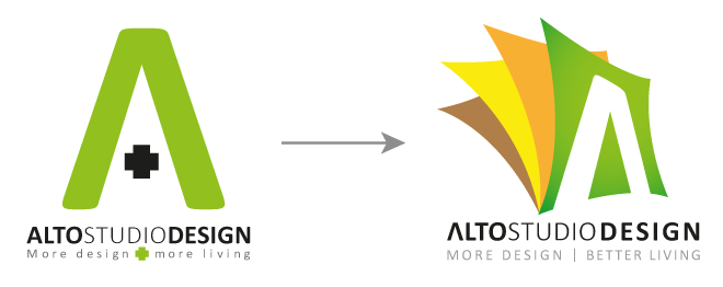
Alto Studio Design is a small interior design company based in Brooklyn, New York. They required a fresh take on their logo. Their brief was to keep the font and the ‘more design, better living’ strapline. The following was my development work (client was a native spanish speaker so this development work retains the original notes in spanish).
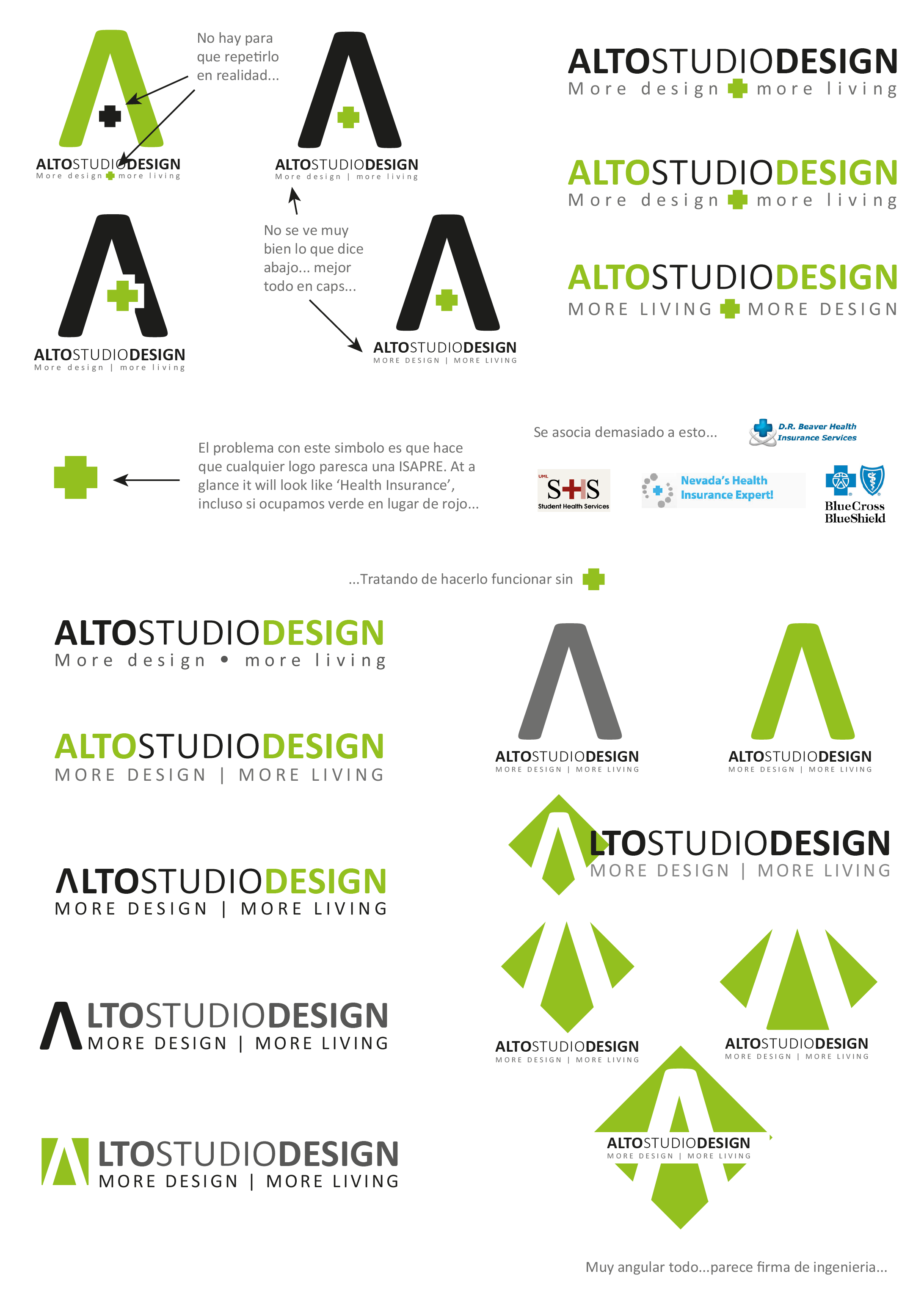
First step was to remove the redundant element of the ‘+’ sign as it could give wrong impressions due to the cross being commonly associated to health care services.
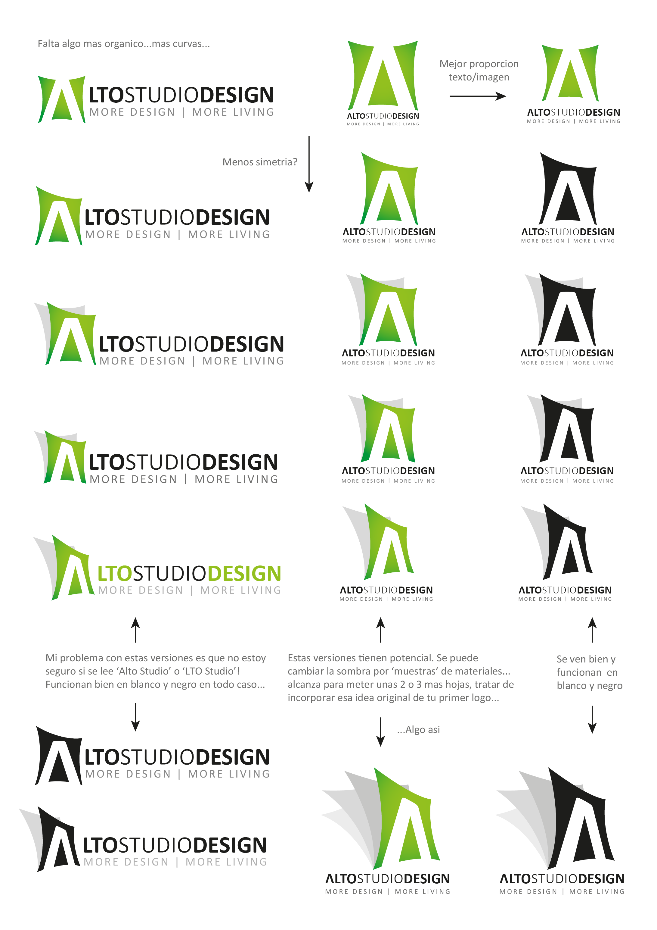
In discussions with the client the subject of palette and textures came about, I thought it would be a good idea to make the logo flexible enough to allow additions of colours and textures for different occasions. For this purpose I decided to add a background to the ‘A’ as a canvas to fill with the colour of choice, as well as making this canvas concave and in latter versions uneven so as to avoid having it look too ‘square’ for an interior design company, it was not an engineering firm after all…
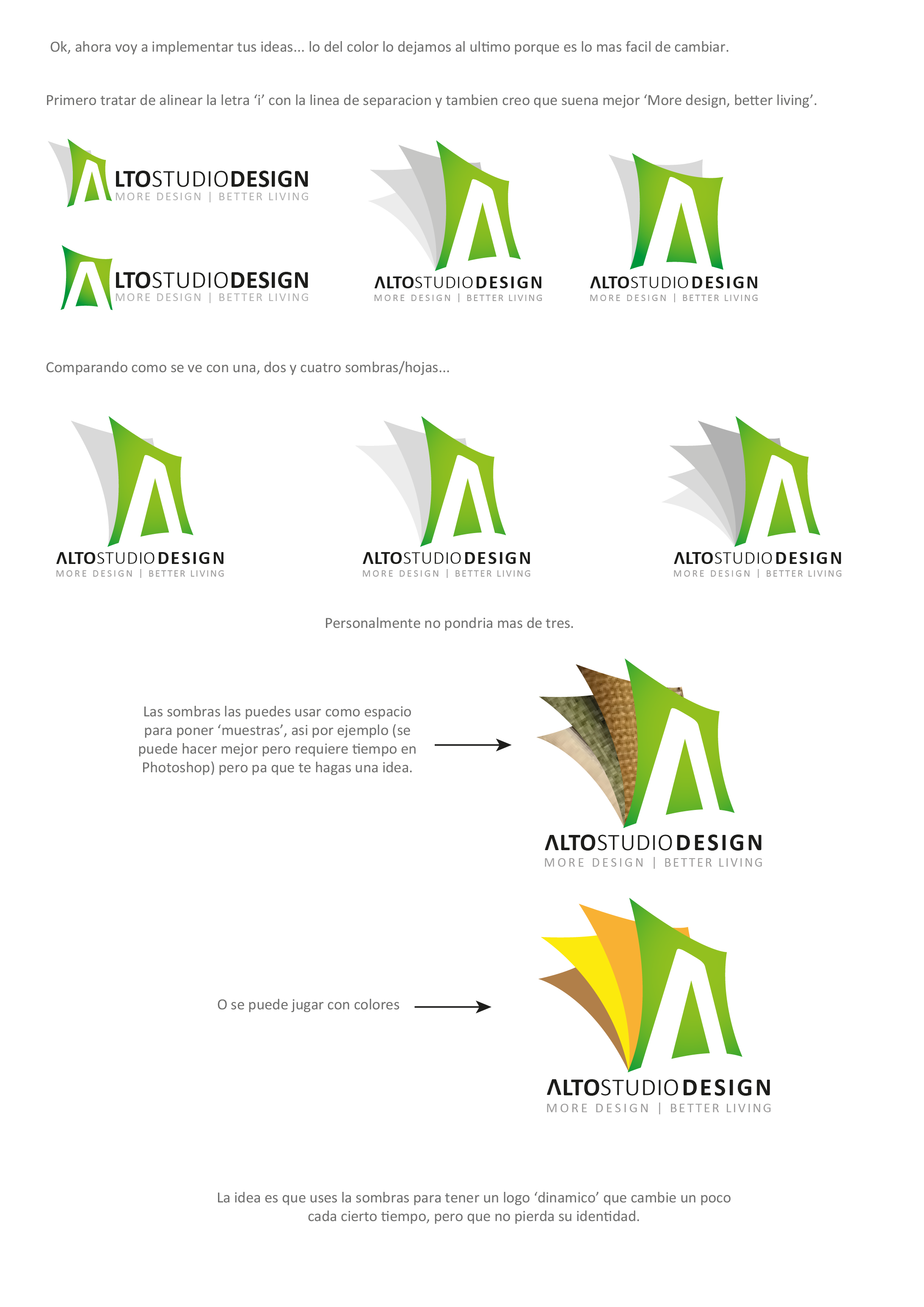
But because we were talking about palettes and textures it seemed necessary to add more ‘pages’ so as to give the option of multiple colours and textures, it was at this stage that the canvas idea was replaced by the portfolio concept. By making the logo a portfolio I gave my client the option to fill the ‘pages’ of the logo with colours and textures of their choice. It would keep the logo fresh and flexible enough, while allowing them to retain their identity with their font and strapline.


Leave a Reply
You must be logged in to post a comment.